Wednesday, 17 October 2012

AH: Print Analysis - Advert


  • The genre of the track and artist is evident by the use of bright vibrant colours suggesting a modern sound to the music. The background helps reinforce this with random textures and patterns which are very typical of the dance genre.
  • The visuals here go against the rule of thirds as the dominant picture of the dog with a boom box as a body is in the centre of the page.  It is clear from the picture that the saturation levels have been turned up to bring out the bright colours even more giving it a clear texture. There is great use of the colour spectrum as the advert has been made to catch peoples attention and stand out.
  • The Mise-en-scene used here can also be looked upon as semiotics, the image is relatively simple with a dog which has a boom box as a body. This may from first impressions seem disjunctive, however after reading the album title of ‘crazy itchy radio’ you see the dog is itching its body which is a boom box (used to play radio). Therefore the image is an amplified representation of the album name.
  • The artists name is clearly displayed at the top of the page and is in a font which is always used by the artist and has been made famous by them. It is typical of the genre as it looks robotic and therefore modern, some words are extended and cut off to give a contemporary feel to the font. The album title at the bottom is in a different font and is a lot smaller than the artists name. The font is simple and clear to reinforce the overall theme of the advert in that it is easy to read, clear, vibrant and catches the attention of audiences.
  • The popular culture reference here is in the form of the boom box which is iconic of the modern genres of music. The boom box is very urban and is a symbol of how urban music is now a dominant force in the music industry.
  • Audiences may consume this advert from a number of different sources. One may be on the Basement Jaxx website where they will have their key audience who they can rely on to purchase their products as they are loyal fans. Also it may be consumed in a music magazine, this is why the advert is bright and eye-catching. It will be in a magazine where people aren't looking for adverts so they have to catch their attention to make them look and read the advert. Finally the advert may be consumed as a poster in a record shop or on the street.

DW: Print analysis - Digipak


  •  The precise genre of this album cover is not particularly clear. However the words “rave” and the use of laser beam club lighting, as well as the white overall which some partygoers wear to “raves” suggest that the music will be dance or club based, therefore perhaps house or drum and bass music. This notion is also reinforced somewhat by the Hospital record label shown in the bottom left hand corner, Hospital Records is a relatively large UK independent record label which specialises exclusively in drum & bass and jungle music. Therefore anyone who knows about the artist or label should be able to deduct that the music is drum and bass 
· Rule of thirds is used in the image to portray the artist and provide an equilibrium. The image has a dark tone - clearly being shot at night, and has been colour corrected to bring out the pink tones, the beams of pink laser may even be an added effect to make them stand out more. The picture looks mysterious and elusive, suiting the name of the album - raves tend to be secretive events which take place only at night. The picture also helps reinforce the album name, almost suggesting that Danny Byrd has “dug up” a rave, added to by the mise-en-scene of a shovel and mound of dirt; therefore giving the image a meaning. Promotion/branding of the artist’s record label shown relatively subtly on the album cover, most likely to gain reputation and recognition.

· Name of the artist and name of the album shown very clearly in thick, simple white font which stands out clearly on the dark background.  The text isn’t unique or bizarre in any way; it is sharp solid and easy to read, however relatively uncreative. The font used is used in nearly every Hospital records advertisement and promotion. The visual doesn't carry much intertextuality, however it is modern and focuses on modern activities and music, there appears to be no parody or pastiche involved in the album cover and the identity of the artist isn’t really put out as a vital element - seeing as you can hardly identify the man. 

· The artist isn’t represented in any particular way, although he is the only prevalent character on the album, his identity is concealed and relatively unclear, thus hardly contributing to any metanarrative. This could be some kind of message or representation which the artist is trying to reveal - that it doesn’t matter about the cover or the content of the image on the album cover particularly, the only thing that matters is how the music sounds , the fact that Danny Byrd is one of the most well known drum and bass artists also reinforces this in that it shows he needs little promotion because of his already high status in the industry.

· This print text would be consumed via advertising - posters, magazine adverts , internet ads etc. websites such as the Hospital Records site for example would advertise this album. The item itself can be bought from most music stores, as well as online, perhaps even in vinyl and mp3 format too. 


Tuesday, 16 October 2012

Group: Brighton reccie


Where did you go and what were your aims?
We visited Brighton and were designated a large area surrounding the pier to shoot a range of different shots, as well as some footage of a One Direction music video which the whole class colaborated on. For our group personally, we wanted to try and test out shots we wanted to use for the final music video production; for us this was predominantly things like close-ups, changes in focus and time lapses. We felt this acted as a decent preliminary task to help us prepare and plan for shooting our final production.

What did you achieve?
We managed to capture nearly an hour of footage in total whilst in Brighton, which we found very helpful. We also managed to find many interesting locations whilst exploring Brighton, some of which we would like to revisit when shooting the music video, or even use some of the footage we got on that day to use in the music video. Not only did we manage to gain a better incite into how we should shoot and frame each shot i.e. camera positioning, what to include in the shot, length of shot etc. but we also learnt more after filming - in the editing of the footage. From the research on music videos we had already done, combined with our footage we put together a small promotional video of what we recorded that day allowing us to gain further knowledge into the editting techniques we should use, for example changes in saturationfast cutting rate and so on.

What problems/obstacles did you encounter?
One large problem we had was that we took too many shortquick shots i.e. close-up shifts in focus. Although this wasn't necesarily detremental or a huge obstacle, it would have helped for us to take a few longer and different shots to break up and add diversity to our promotional video. Not only this but we realised lighting was very important to create an upbeat video such as ours, at the start of the day the weather was very poor and when filming the shots looked quiet dull and uninteresting, but when the weather improved and there was more natural light the shots looked much nicer and even more professional. Even this however had its problems, sometimes the light was too bright and items wouldnt focus properly as the shot was too bright - this is something we must learn to combat when filming our final piece.

What did you learn that you can take into the next shoot?
We learnt a great deal from our Brighton reccie, we must be sure for our next shoot to take a wider range of shots - to give the video more diversity, the more content the better. We also learnt more about the actual functionality of the camera, how to use it to it's best ability i.e. changing frame rates and shutter speeds, brightness etc. and what effect it can have - how it can help us. Brighton being quite a diverse town in itself helped us, seeing as this type of environment is what we want for our video it gave us a taste of what shooting the final peice would be like. We certainly learnt a lot from the Brigthon reccie, on both the editing and shooting side of things.

Group: Concept development 15th october

In the lesson today we discussed the pitch further, each doing separate slides and preparing them for the pitch to the class on Thursday.

We also discussed the detailed storyboard that we will have to do in the near future - what shots we will need to include and in what order.

We also planned further into a shoot that we intend to do at a party on Saturday (20th October) we talked about getting to the party early in order to arrange a few camera positions etc. and also make clear where we can and can't film

Monday, 15 October 2012

Moodboard

I can't find your moodboard? You need to upload your Brighton footage before the lesson on Wednesday - you know you can't do it in school. I don't see your concept development for today either?

Group: Audience questionnaire

http://www.surveymonkey.com/s/NQB7VGM

Link to our audience research questionnaire.

Friday, 12 October 2012

Group: Location reccie

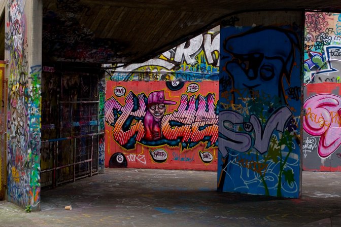
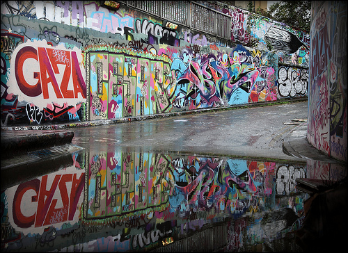
We had our first location reccie at South Bank skate park alongside the river thames and also Leake street at Waterloo East train station. We picked out positions for potential shots as well as brainstormed ideas for props, costume and lighting. Doing this reccie allowed us to gain more knowledge about the area and also gave us more ideas for our shots we could include in the final production. Below are some pictures of the locations.